Analyzing Neural Networks for Decision Support
Источник: Joseph P. Bigus "Data Mining with Neural Networks Solving Business Problems - from Application Development to Decision Support" McGraw-Hill New York 1996, p.99-109
"It is a capital mistake to theorize before one has data."
Sir Arthur Conan DoyleWhen data mining is used for decision support applications, creating the neural network model is only the first part of the process. The next part, and the most important from a decision maker's perspective, is to find out what the neural network learned. In this chapter, I describe a set of postprocessing activities that are used to open up the neural network "black box" and transform the collection of network weights into a set of visualizations, rules, and parameter relationships that people can easily comprehend.
Discovering What the Network Learned
When using neural networks as models for transaction processing, the most important issue is whether the weights in the neural network accurately capture the classification, model, or forecast needed for the application. If we use credit files to create a neural network loan officer, then what matters is that we maximize our profit and minimize our losses. However, in decision support applications, what is important is not that the neural network was able to learn to discriminate between good and bad credit risks, but that the network was able to identify what factors are key in making this determination. In short, for decision support applications, we want to know what the neural network learned.
Unfortunately, this is one of the most difficult aspects of using neural networks. After all, what is a neural network but a collection of processing elements and connection weights? Fortunately, however, there are techniques for ferreting out this information from a trained neural network. One approach is to treat the neural network as a "black box," probe it with test inputs, and record the outputs. This is the input sensitivity approach. Another approach is to present the input data to the neural network and then generate a set of rules that describe the logical functions performed by the neural network based on inspections of its internal states and connection weights. A third approach is to represent the neural network visually, using a graphical representation so that the wonderful pattern recognition machine known as the human brain can contribute to the process.
The technique used to analyze the neural networks depends on the type of data mining function being performed. This is necessary because the type of information the neural network has learned is qualitatively different, based on the function it was trained to do. For example, if you are clustering customers for a market segmentation application, the output of the neural network is the identifier of the cluster that the customers fell into. At this point, statistical analysis of the attributes of the customers in each segment might be warranted, along with visualization techniques described in the following. Or we might want to view the connection weights flowing into each output unit (cluster) and analyze them to see what the neural network learned were the "prototypical" customers for that segment. We might then want to cluster the customers from a segment into additional clusters. This would allow us to drill down to a finer and finer level of details, as required. In modeling and forecasting applications, the information discovered by the neural network is encoded in the connection weights. The most obvious use of the trained neural network is to use it to play what-ifs against the model. If a neural network has learned to model a function, even if you don't have a mathematical formula for the function, you can still learn a great deal about it by varying the input parameters and seeing what the effect is on the output. Let's say we built a model of the yield or return on investment for a set of products. If we input the data on a set of proposed development projects, we can use the estimates in our evaluation of their business cases. Or we can do a complete sensitivity analysis of the inputs to determine their relative importance to the return on investment.
Sensitivity Analysis
While there are many different types of information that might be gleaned using data mining with neural networks, perhaps the crucial thing to learn is which parameters are most important for a specific function. If you are modeling customer satisfaction, then it is important to know which aspect of your customer relationship has the most impact on the level of satisfaction.
If you have a fixed number of dollars to spend, should you spend it on a new waiting room for your customers, or should you hire another technician so the average wait is 10 minutes less? Determining the impact or effect of an input variable on the output of a model is called sensitivity analysis.
A neural network can be used to do sensitivity analysis in a variety of ways. One approach is to treat the network as a "black box." To determine the impact that a particular input variable has on the output, you need to hold the other inputs to some fixed value, such as their mean or median value, and vary only the input while you monitor the change in outputs. If you vary the input from its minimum to its maximum value and nothing happens to the output, then the input variable is not very important to the function being modeled. However, if the output changes considerably, then the input is certainly important because it affects the output. The trick in performing sensitivity analysis in this way is to repeat this process for each variable in a controlled manner so that you can tell the "relative" importance of each parameter. In this way, you have a ranking of the parameters according to their impact on the output value. For example, let's say we are modeling the price of a stock. We build a model and then perform input sensitivity analysis. When we look at each input variable, we might see that the day of the week is the most important predictor of what is going to happen to the price of the stock. We could then use this information to our advantage.
A more automated approach to performing sensitivity analysis with back propagation neural networks is to keep track of the error terms computed during the back propagation step. By computing the error all the way back to the input layer, we have a measure of the degree to which each input contributes to the output error. Looking at this another way, the input with the largest error has the largest impact on the output. By accumulating these errors over time and then normalizing them, we can compute the relative contribution of each input to the output errors. In effect, we have discovered the sensitivity of the function being modeled to changes in each input.
Rule Generation from Neural Networks
A common output of data mining or knowledge discovery algorithms is the transformation of the raw data into if-then rules. Standard inductive learning techniques such as decision trees can easily be used to generate such rule sets. One of the reasons this is so straightforward to do with decision trees is that each node in the tree is a binary condition or test. If value A is greater than B, then take one branch of the tree, else take the other. However, as has been pointed out before, having to define some arbitrary point as the dividing line between two sets of items will certainly lead to crisp answers, but not necessarily the correct ones.
One of the perennial criticisms of neural networks has been that they are a "black box," inscrutable, unable to explain their operation or how they arrived at a certain decision. One very effective representation for knowledge, especially in classification problems, is to derive a set of rules from the raw data. One can then inspect this set of rules and try to determine which inputs are important. In this case, the neural network data mining process is transforming a set of data examples into a set of rules that tries to explain how the inputs cause the data to be partitioned into different classes.
Early on in the renaissance of neural networks, they were often compared and contrasted with rule-based expert systems. One point became clear. It is quite easy to map from a rule set to an equivalent neural network, but it is not so easy to go the other way. Why? Because the nonlinear decision elements in a neural network have more expressive power than the simple Boolean conditions used in most expert systems. This is not to say that neural networks somehow subsume the functionality that rule-based expert systems provide. In fact, I was one of the first to explore the relationships and synergy between neural networks and expert systems (Bigus 1990). Rather, the point is that neural networks, with their collection of real valued weights and nonlinear decision functions, are quite complex computing devices. Mapping their function onto a set of Boolean rules is challenging but certainly not impossible.
Gallant's (1988) pocket algorithm was one of the first attempts to map neural networks into rules. However, he used a neural network with Boolean decision elements, which simplifies the problem. Several researchers have tried to convert standard back propagation networks into rule sets. Narazaki, Shigaki, and Watanabe (1995) use a technique against trained networks with continuous inputs. They use a function analysis approach to identify regions in the input space that control the network output values. Other research in rule generation from neural networks include work by Kane and Milgram (1994) and Avner (1995).
Visualization
While neural networks are powerful pattern recognition machines in their own right, there is still nothing so powerful as the human ability to see and recognize patterns in two- and three-dimensional data. Consequently, visualization techniques play an important role in the analysis of the outputs of the data mining process. Actually, visualization is often used in the data preparation step to help in the selection of variables for use in the data mining application. In this section we look at a variety of graphical representations of data, of neural networks, and of the outputs of the data mining algorithms.
Standard graphics
Anyone who has used a spreadsheet, such as Lotus 1-2-3, is familiar with the wide range of charts that are used to view data. We take these graphic views to be somewhat standard visualization techniques. They include bar charts or histograms, scatter plots for viewing two-dimensional data, surface plots for viewing three-dimensional data, line plots for seeing a single variable change over time, and pie charts for viewing discrete variables.
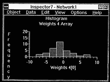
The IBM Neural Network Utility (NNU) provides these visualizations through its Inspector windows (IBM 1994). In Figure 6.1, a histogram of the distribution of an input variable is shown. By using this view on each input parameter, we can see whether the data is badly skewed and also whether outliers are present. This information can be used in data cleansing and in deciding what data preprocessing functions are required.
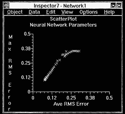
Figure 6.2 illustrates an NNU scatter plot view, where the X axis is the average RMS error and the Y axis is the maximum RMS error. This graphic can be used to easily see whether the neural network is converging to a solution. Although basic, these standard types of graphics can be used to good effect.
Over the past decade, a set of views specific to neural networks has been developed. These provide information about the network architecture, processing unit's state, and connection weights. In the following section I describe these graphical views.
Neural network graphic
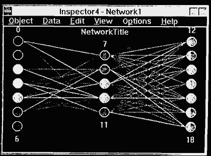
A useful technique for viewing the state of a neural network is a network graphic, such as that provided with NNU to show the neural processing units and their interconnections (see Figure 6.3).
Figure 6.1 Histogram view.
Figure 6.2 Scatter plot view.
The topology of the network is apparent from the number of processing elements in each layer and the number of layers drawn in the graphic.
The activations of the processing units are depicted as circles, and their values are indicated through the use of colors. NNU allows thresholds to be set for on/offiundecided states, which are shown using red/blue/white colored circles.
Connection weights are drawn as lines connecting the processing units. The sign of the connection weight is indicated using color (red for positive weights, blue for negative valued weights). In NNU, thresholds can be set so that only weights whose magnitude is larger than the threshold will be shown. This is an easy way to determine which inputs have a large impact on the network output by seeing which input units have large connection weights into the hidden layer. Some neural network developers try to assign labels to the hidden units by watching the unit activations and correlating them with the value of certain inputs.
Hinton diagram
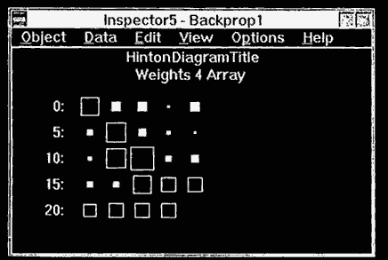
The connection weights contain information about the relative importance and correlation between input variables. In some sense, the absolute magnitude and the sign can be used as an indication of the importance of the input. One of the most popular visualization techniques used with neural networks is the Hinton diagram, named after researcher Geoffrey Hinton. A Hinton diagram is a collection of boxes whose size represents the relative magnitude of the connection weight and whose color depends on its sign, positive or negative. Hinton diagrams are an excellent way to visualize the weights in a neural network. Figure 6.4 shows the NNU Hinton diagram view of the weights of a back propagation network.
If we are performing some high-level function with a data mining tool, then we also need to view the results from the same high-level perspective. For example, if we are trying to cluster our customer base, we need tools to help us analyze those clusters and determine what they mean. Even data mining algorithms that output rules, which are supposedly easy to understand, can benefit from visualization techniques.
Clustering and segmentation visualization
IBM in Hursley, UK has developed a set of data mining and visualization tools to support its consulting practice in the insurance, finance, and travel industries.
Figure 6.3 Network graphic.
Figure 6.4 Hinton diagram graphic.
The statistical attributes of the members of the selected cluster are displayed as pie charts or bar charts against the population statistics.
Sifting through the Output Using Domain Knowledge
When a data mining algorithm is used to process data, it performs a transform, usually from some high-dimensional data into some more understandable form. In most cases, however, even though the data was transformed, the volume is still too large to be easily digested by an analyst. If we transform 1,000,000 records into 1000 rules or facts, then that is goodness. However, if someone then has to analyze the 1000 facts by hand, then that is not goodness. There might be only ten important facts in the 1000. How can we help the data mining tool provide only those facts that contain important information? One major way is to provide domain knowledge to guide the search. To do this requires objective functions that can be used to measure the value of the generated rules.
Summary
While neural networks are wonderful pattern recognition machines, they do not easily give up the secrets of what they learned. The "knowledge" they gain through the data mining process is implicit in their structure and in the values of the connection weights. So while we might have transformed a million records into a thousand weights, the task still remains to translate that compressed information into a form that people can easily understand.
For clustering or segmentation, the output of the data mining process is the assignment of each input pattern into a cluster of other similar inputs. Thus the valuable information learned from this process is easily obtainable for use by a data analyst. Likewise, when neural networks are used for classification, modeling, or forecasting, the output of the neural network is, at face value, valuable information that can be used in decision support applications. No one would argue that it is not useful to know that for a given set of inputs, sales would increase 10%, or that by changing the amount of a chemical in a process that the yield would increase 5%. This sort of information is readily available and easily extracted from a trained neural network. But that assumes we are treating the neural network as a "black box" system. Some people are uncomfortable with this type of data mining.
Another approach is to use our "black box" neural network to determine the relative importance or sensitivity of the model to changes in the various inputs. This information is more understandable because it can be represented by rules, such as, "If variable X increases 5%, then output Y decreases 10%." Neural networks that are trained using the back propagation learning algorithm can automatically compute the relative importance or sensitivity of the inputs as a by-product of the training process. This information includes ranking the inputs by the relative contribution to the prediction error.
Using computer graphics for visualizing the information contained in a neural network is another way to overcome the black-box objection. Neural network graphics can show the sign and magnitude of connections and the activation values on the processing units. Specialized graphics such as Hinton diagrams clearly depict neural network connection weights and clustering results. Other more standard graphics such as line plots, scatter plots, histograms, and surface plots can be used to evaluate input data for data cleansing and preprocessing, and to analyze the accuracy of neural network predictions.