Visualising Software in Virtual Reality
Authors: Peter Young, Malcolm Munro
Source: Proceedings. 6th International Workshop on Program Comprehension. IWPC'98 (Cat. No.98TB100242)
Abstract
Software visualisations of one form or another appear in numerous software maintenance tools. Visualisation is arguably one of the most profitable means of communicating information to a user. As software systems become larger and more complex we find ourselves in greater need for techniques to visualise such large information structures. This paper concentrates on visualising software systems using 3D graphics and VR technology. The main concepts of 3D software visualisation are introduced as well as a set of desirable properties which act as both guidelines for designing a visualisation and also as a framework for evaluating existing visualisations. A prototype visualisation, FileVis, is described and evaluated against these desirable properties.
Introduction
The problems of maintaining software systems are well documented. The increasing size and complexity of modern software serves only to worsen matters. The more traditional
problems faced during maintenance are now compounded by the sheer scale of modern software which introduces a unique range of issues more commonly found in fields such as databases and information retrieval. Software maintainers are typically confronted with very large and very complex software systems that are often completely alien to them. At this point they will normally have some maintenance task to perform though possibly little indication of where or how to start.
One problem expressed by software engineers is that when confronted by a large, unfamiliar mass of code, they have no notion of what components it consists of, or how it is structured. Only by searching through the source code files, directory structures and scant documentation can any such information be obtained. In order to perform maintenance on a particular area of the code it is first necessary to identify the appropriate area then determine its purpose and context with respect to the rest of the system. Essentially, the maintainer needs an overview of the software structure yet requires detail on the specific area they are interested in. The latter can be found by inspecting the source code, but gaining an overview of a software system is particularly difficult. This is an area in which software visualisation can be particularly profitable.
3D Software visualisation has the potential to aid the maintenance process and enhance a user’s understanding of a software system; however, this potential has been left largely under-utilised [5]. One area in which visualisation can help this process is in producing a picture of the software. By creating a physical (visual) object, which represents the software system, engineers can gain some initial insight into how it is structured and what it is composed of. This allows the engineers to make full use of their natural perceptual skills in investigating and understanding the software.
This paper defines the main areas that must be considered when creating 3D software visualisations. The notion of visualisations and representations are introduced as a mechanism for evaluating the effectiveness of 3D software visualisations. To measure this effectiveness a set of desirable properties for visualisations and representations has been created. These properties can act as guidelines in the creation of new visualisations, or as a rough evaluation of the features in an existing 3D software visualisation.
3D Software Visualisation
We have identified six key areas which must be considered when designing 3D software visualisations. These areas are general in scope but are of a fundamental importance. Careful consideration must be made as to how a new visualisation will address each of these six points:
- Representation: This is concerned with how the various components of the software system are shown graphically and also how information about those components can be encoded into that graphical representation. This is arguably one of the most important aspects of a visualisation and careful decisions must be made. The graphical representations used will determine the overall structure and feel of a visualisation and could make the difference between an intuitive and highly useful visualisation or a confusing and off-putting one. Design factors here will impact on all the other key areas listed below and vice versa.
- Abstraction: One of the main aims of software visualisation is to abstract information away from the low-level detail, for example the source code, and present it in a more useful, higher level representation. In deciding the level of abstraction to be used we must determine what information will be presented and also in how much detail to present it. The level of abstraction implemented will greatly affect how, and for what tasks the visualisation tool itself will be used.
- Navigation: Information sources such as document collections and particularly software systems are typically very large. It follows that the visualisations of such information will also tend to be large. It is important that users can easily navigate their way through the visualisations without becoming lost or disorientated. Features such as signposts, landmarks, paths and districts all aid in creating a legible environment [3, 4]. Navigation is a wide ranging term including the legibility of the environment, yet it is also concerned with tools which can aid navigation, such as maps, bookmarks or teleports which perhaps are more suited to the category of interaction.
- Correlation: Visualisations only constitute another view of a software system or information store. They present additional information on the system, they do not replace the information already available. It is important to be able to link the visualisations in with other forms of information, for example the source code or documentation in the case of software systems. Providing a readily understandable correlation between the visualisation and the underlying information is vital if the visualisation is to be of any use. The actual changes made to software occur at the code level so relationships between the objects in the visualisation and actual points in the source code must be clearly visible or easily accessible.
- Automation: An important point to consider when designing information visualisations is to what extent the creation of the visualisation is automated. It is necessary to determine how much of the visualisation is generated automatically and how much control the user has over the process or the result. The goal of software visualisation is to aid the understanding of software systems, often this understanding is best obtained by practical exercises. Allowing the user to 'build' the visualisations while investigating areas of the software system may prove more intellectually profitable than fully automating the process with the user then gaining their understanding from the completed visualisation. Other automation issues include layout algorithms/heuristics, legibility, resilience to change, etc.
- Interaction: Creating a suitable visualisation is only one part of the problem. Complex visualisations will inevitably require some form of interaction with the user. This interaction may be no more complex than navigating the visualisation or, in contrast, performing some complex data mining using visual query techniques [1]. Consideration must be made as to how the user will interact with the visualisation and how they can manipulate its contents or build upon it with higher level semantic information. The subject of interaction also covers any virtual tools which could be used in the environment for various purposes. For example, a map, a virtual display screen (for displaying documentation, source code listings, etc.), or editing tools for customising or annotating the visualisation.
Visualisations and representations
In attempting to create or evaluate a 3D visualisation we first identified desirable properties which are important for a visualisation to be effective. In order to derive these desirable properties we found it necessary to divide the concept of a visualisation into two distinct levels. These levels have been termed visualisations and representations. The properties and goals of each division vary sufficiently to warrant such a distinction. These two terms can be defined as follows:
- Representation: A graphical (and other media) depiction of a single component.
- Visualisation: A collection or configuration of individual representations (and other information) which comprise a higher level component.
Effectively, representations are the graphical symbols used in a visualisation to depict each of its subcomponents. For example, in a typical graph such as a call-graph or control-flow graph, the graph itself is the visualisation while the nodes and arcs are the representations. These terms are, however, interchangeable and they depend greatly on the level of abstraction and amount of detail being presented. A graphical object can be both a representation within one context and a visualisation within another. For example, if a node in a function call-graph provided further information on the structure or qualities of the function it represented. In the context of the software system (i.e. the graph) it is a representation, whereas in the context of the function (i.e. the node) it is a visualisation of further information on that function. In such cases we must consider carefully the structure and properties of the object both as a visualisation and as a representation and also in the transition between these distinctions.
Desirable properties of a representation
The following list highlights some important properties which must be considered when creating a representation or evaluating the merits and effectiveness of a given representation. Several of these properties are mutually exclusive, thus a good representation will achieve a suitable compromise between them.
Individuality
Representations of different components should appear differently. Also, representations of identical components, which are displayed in the same context, should appear identical. For example, in a standard function call-graph, it is typically the textual node label which makes a representation unique.
Distinctive Appearance
Differing representations should appear as contrasting as possible. Representations should be easily recognisable as being either identical or dissimilar, even when in a large visualisation. This property contradicts with that of low visual complexity. To create a distinctive appearance among many representations you must increase the visual complexity of the representation.
High information content
Representations should provide as much information as possible about the component. The problem here is that as the information content is increased, inevitably the visual complexity will also increase.
Low visual complexity
Representations should not be visually over complicated. This is beneficial both to the performance of the visualisation system and also to the user's comprehension of the information encoded in the representation. Additionally, to achieve a distinctive appearance the representation should maintain as little visual complexity as possible. There must be a trade-off as to whether we can expect the user to distinguish between a small number of complex representations and a larger number of simple representations.
Scaleability of visual complexity and information content
Mechanisms would be desirable for reducing or increasing the amount of information presented or the visual complexity of representations, depending on the context in which they are used. This would allow both detailed displays of a small number of components, giving maximum information, as well as overviews of large component collections that would display less information about the individual components.
Flexibility for integration into visualisations
This is a very important issue which affects both the representations and the visualisations in which they are used. Benedikt [Benedikt91] proposed that representations or objects contained both intrinsic and extrinsic dimensions which could be used for encoding information. Extrinsic dimensions include properties such as position and motion. Intrinsic dimensions include properties such as size, shape, colour and angular velocity. As a representation makes use of more intrinsic dimensions it becomes less flexible for integration into a visualisation. Using up resources such as colour, shape, and particularly size to encode information reduces the scope for providing information within the visualisation. For example, colour may be desirable for differentiating between different classes or groups of components within a visualisation. However, if the representations for the components have already been assigned colours (as an intrinsic dimension) to represent other information then colour cannot easily be used by the visualisation. The size of representations is also very important, irregular or variable sized representations will be harder to position, group and view within the visualisation. For example, if a representation uses it's size to encode some information and the visualisation uses the positional depth (Z co-ordinate) of the representations to encode other information. Confusion will occur when differentiating between a component being near or big and far or small.
Suitability for automation
Another important aspect of any visualisation or representation is it's ability to be automatically generated relatively easily. The majority of useful visualisations will be generated by an automatic process with some degree of user intervention. Features such as irregular shapes or variable sized representations can often hinder or complicate this process. Representations should therefore be designed with automation in mind
Desirable properties of a visualisation
The following list highlights some important qualities which must be considered when designing a visualisation. As with the desirable properties of representations, many of these qualities are mutually exclusive and compromise must be made.
Simple navigation with minimum disorientation
Visualisations should be designed with the user in mind. As the user will be 'submerged' within the data, it will be necessary to structure the visualisation and add features to aid them in navigating through the visualisation. The goal here is for the users to become familiar with the information terrain and to reduce the chance of becoming 'lost'. Techniques developed and highlighted in the LEADS (Legibility Enhancement for Abstract Data Spaces) project may be applicable here [4]. These include the generation of features such as landmarks, districts and edges which have been proven to aid navigation through urban environments.
High information content
Visualisations should present as much information as possible without overwhelming the user. Again, there must be a trade-off between high information content and a low visual complexity. Both are desirable yet contradictory.
Low visual complexity, should be well structured
The structural complexity of a visualisation will undoubtedly be dependent on the complexity of the information presented, however, effort should be made to reduce the visual complexity of the visualisations. A wellstructured data terrain should also result in a more understandable layout and easier navigation.
Varying levels of detail
The level of detail, information content and type of information presented should vary to cater for the users' interests. For example, when a user first ‘enters’ the visualisation their first expectation will be to see the visualised system in its entirety. Once they have familiarised themselves with the overall structure they will then begin investigating areas of interest in detail. The visualisation should support this change in interest and provide increasing detail and information as the user moves towards a component or expresses an interest in a component.
Resilience to change
Small additions or changes to the information content of the visualisation or shifts in the users interests should not result in major differences in the visualisation. Major changes such as a full repositioning of representations will result in the user becoming disorientated and having to re-learn the structure of the environment.
Good use of visual metaphors
Metaphors introduce familiar concepts to the user of the visualisations and provide a good starting point for gaining an understanding of the visualisation.
Approachable user interface
The user interface to the visualisations should be flexible enough to provide intuitive navigation and control, yet should not discourage the user or introduce any unnecessary overheads. For example, while fully immersive hardware would be of great advantage in using the visualisations, it would prove more practical to use standard hardware and interfaces, i.e. a computer monitor and suitable input device such as a mouse.
Integration with other information sources
Visualisations provide a different viewpoint on the information they are presenting, in most cases they cannot entirely replace that information. It is desirable to be able to correlate between the visualisations and the original information, or other views on it. For example, visualisations of a software module structure could be linked to the actual source code of that module.
Good use of interaction
Visualisations can benefit greatly by allowing the users to interact with them in various ways. This provides mechanisms for gaining more information and also helps maintain interest.
Suitability for automation
As with the representations, a good level of automation is required in order to make the visualisations of any practical worth.
A prototype system
The File Visualisation (FileVis) is a prototype visualisation which is aimed at providing a high level overview of a software system’s structure (Figure 1). The goal of this visualisation is to allow a maintainer to familiarise himself or herself with the software and identify any important or interesting areas before they commence their maintenance work. It is often the case that the maintainer will have no previous experience with the software system he is asked to work on. First contact with the system involves a high degree of learning during which the maintainer must understand as much as possible about the system as a whole before beginning work on a specific area. Visualisations such as FileVis attempt to support this learning process by providing a more intuitive and easily accessible method for browsing and investigating various aspects of a software system. The software system is no longer an abstract mass of files and information, it has become something tangible, you can see the software.
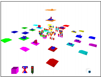
Figure 1 — Overview of a software system using FileVis
As well as the 3D visualisation, FileVis is an integrated WWW presentation consisting of three main frames or windows. The primary frame contains the actual 3D visualisation itself along with a button-bar of pre-set camera positions. The remaining two frames are used to display any other information which is currently relevant in the 3D visualisation. Virtual environments typically are not particularly effective at displaying textual information, hence the 3D visualisation simply displays any detailed information in these HTML frames. One frame is reserved for displaying information on currently selected objects in the 3D world, while the other is used to display the relevant section of the source code files for these selected objects.
FileVis is a prototype visualisation based around the C programming language. As the name implies, FileVis is structured around the various C source code files within a software system and the contents of those files. Each file is represented within the virtual environment as a flat, coloured box or pedestal. The nature and syntax of the C language dictates much of the form and concepts used in FileVis. As such, there are two main types of file, definition files (.C) and declaration files (.H). These two file types are indicated by a glyph (the 3D equivalent of a graphical icon) in the bottom right corner of each pedestal. A spherical glyph indicates a definition file and a cylindrical glyph indicates a declaration file. Files with the same name (i.e. test.C and test.H) are both coloured identically to indicate their relationship. The declarations in test.H
should (though not necessarily) match the definitions in test.C
.
To show the dependencies between the various files a CallStax visualisation [6], which uses the file glyphs, is constructed in the centre of the visualisation. Selecting any of the glyphs in the CallStax or a glyph on a file pedestal results in the CallStax aligning themselves accordingly. From this it can be seen which files include other files or libraries, and also which files are shared through the system. Additionally, selecting any files in this manner results in information on that file to be displayed in one of the HTML frames and the file contents to be displayed in the other. This information includes hypertext links between each of the frames and the 3D world allowing the user to browse the software system using a variety of techniques.
In its current state FileVis shows only the function definitions within each of the files. As such, only the definition files (.C) are populated whereas the declaration files (.H) do not yet contain any further information. Upon each file pedestal is a number of blocks which represent each of the functions defined within that file. These function representations have two levels of detail, as the user approaches closer to a particular file or function, they switch from a low detail to high detail representation which gives more information on the function definition. This also has the effect of minimising screen clutter and information overload when viewing from a distance, but more importantly it emphasises the main characteristics of the function by reducing the number which are visible.
The function representations are split into two versions, one low detail for distance viewing and one high detail for closer inspection. The low detail representation emphasises only two characteristics of the function, its length and relative complexity (Figure 2). This is represented as a featureless block of fixed base dimensions. The height of the block represents the length of the function while the colour of the block represents the function’s relative complexity with respect to all other functions in the program. The complexity is shown as a colour scale from deep blue to bright red representing low to high complexity. Using these simple attributes it is possible to quickly assess the distribution of functions within the software system. Long or highly complex functions or files can be identified quickly by simply surveying the virtual landscape.
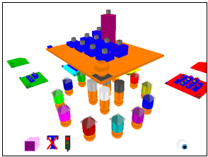
Figure 2 — Illustrating a file containing some low-detail function representations
As the viewpoint moves towards a particular function representation, at a certain threshold the low detail tower will be replaced with a similar sized high detail representation (Figure 3). This high detail representation consists of a number of different information items or attributes related to that function. This includes various metrics such as complexity and a breakdown of the lines of code, comment and blank lines in the function. Additionally a simplified representation of the functions' control structure and textual structure is provided.
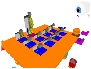
Figure 3 — The high-detail function representations appear as the viewer moves closer
Evaluation
The desirable properties of visualisations and representations introduced earlier are intended as both guidelines for development of 3D software visualisations, and also as a framework for evaluation of a visualisation. The FileVis visualisation was constructed with these guidelines in mind. Some desirable properties are in direct conflict with each other meaning that a great deal of compromise must be made in order to produce a well balanced visualisation. By now evaluating various aspects of FileVis against the desirable properties, we can begin to see where a compromise was made and which aspects suffered as a consequence.
Within the FileVis visualisation as a whole there are a great many visualisations and representations, we will select a small set of each for our evaluation. Firstly, we must identify the components within FileVis as being either visualisations or representations (or a mixture of both). This is shown on Figure 4 which lists each visualisation within FileVis, at each stage showing the corresponding representations used. We will select for evaluation the FileVis, Files and high-detail function visualisations, and also the Files, high-detail and lowdetail function representations. Our criteria will be that aspects of the visualisations and representations will address each of the desirable properties as best as possible.

Figure 4 — Visualisations and representations
Evaluating the visualisations
The properties of each visualisation are evaluated against the list of desirable properties and their suitability is summarised using a simple scale of excellent; good; fair; poor; bad; none and not applicable. This evaluation is shown on Figure 5.
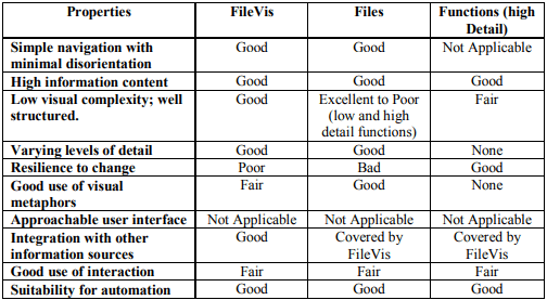
Figure 5 — Summary of visualisation properties
We can see from Figure 5 that the three visualisations selected perform well against our evaluation criteria. One area that lets down both FileVis and the Files visualisations is their resilience to change. In both cases though, this is dependent on the layout algorithm used. Selection of a different layout criterion or maintaining object positions between revisions would help considerably.
Evaluating the representations
The properties of each representation are evaluated against the list of desirable properties and their suitability is summarised using the same simple scale. This evaluation is shown on Figure 6.
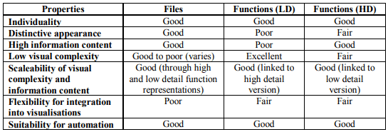
Figure 6 — Summary of representation properties
Looking at the summary on Figure 6, we can see that the three selected representations do not perform as well under the desirable properties. The high-detail (HD) and low-detail (LD) function representations are, however, intended to work in tandem with each complementing the other’s weaknesses. It can be seen from the figure that the HD function makes up for the LD function’s lack of information content and distinctive appearance, the reverse can be said for the visual complexity.
Conclusions
This paper has shown that we can find new visualisations and representations for the structure of a software system. These move away from the conventional visualisations of directed graphs and expand into a more flexible and information rich environment. The new visualisations and representations make use of virtual worlds rather than the more familiar and more limited flat visualisations [2]. One such system, FileVis, was introduced and evaluated here.
In order to evaluate any new visualisations and representations an evaluation framework has been proposed based on a set of desirable properties. This framework has been used to evaluate the FileVis visualisation which performed well against the evaluation criteria. The outcome showed that the FileVis visualisation and it’s components managed to address the majority of the desirable properties, making compromise only when necessary. It is also apparent from the evaluation that the different components must behave both as visualisations and representations depending on their context. It is necessary to find a good compromise between the desirable properties of each, FileVis manages to achieve this compromise.
Further work on the evaluation framework needs to be carried out in order to make assessment more effective and quantifiable. For example, providing a more quantitative scale for each of the properties so that a score could be given to a visualisation as opposed to the qualitative approach used here. Other desirable properties may also be introduced.
References
- J. Boyle, J. Fothergill, P. Gray and S. Leishman, Development of a Visual Query Language, Aberdeen University, 1993.
- E.L. Burd, P.S. Chan, I.M.M. Duncan, M. Munro and P. Young, Improving Visual Representations of Code, Technical Report 10/96, Centre for Software Maintenance, Department of Computer Science, University of Durham, 1996. http://www.dur.ac.uk/~dcs3py/pages/work/Document s/tr-10-96
- R. Ingram and S. Benford, Legibility Enhancement for Information Visualisation, Proceedings of Visualisation '95, Atlanta, Georgia, October 30th — mdash; mdash; November 3rd, 1995.
- R.J. Ingram, Legibility Enhancement for Information Visualisation, PhD Thesis, Department of Computer Science, University of Nottingham, September 1995.
- P. Young, Three Dimensional Information Visualisation, Technical Report 12/96, Centre for Software Maintenance, University of Durham, March 1996. http://www.dur.ac.uk/~dcs3py/pages/work/Document s/index.html
- P. Young and M. Munro, A New View of CallGraphs for Visualising Code Structure, Technical Report 03/97, Centre for Software Maintenance, University of Durham, January 1997. http://www.dur.ac.uk/~dcs3py/pages/work/Document s/index.html