Douglas A. Wiegmann, Thomas J. Overbye, Senior Member IEEE, Stephan M. Hoppe, Gavin R. Essenberg, Yan Sun, Student Member, IEEE
Human Factors Aspects of Three-Dimensional Visualization of Power System Information
Information source: http://www.pserc.wisc.edu/ecow/get/publicatio/2006public/
ABSTRACT
This paper presents experimental results associated with human factors aspects of using three-dimensional (3D) visualizations to display electric power system generation information on one-line diagrams. The paper’s results are based on an experiment performed at the University of Illinois at Urbana-Champaign using electric power system students. The results indicate that compared to standard 2D one-line displays, 3D visualizations of generator output and reserves can be used successfully on one-line displays to improve both the speed and accuracy of certain tasks.
Index Terms—Power System Operations and Planning, Power System Visualization, 3D, Human Factors.
I INTRODUCTION
Power system analysis and operations requires the consideration of a large amount of multivariate data. For example, even in a simple power flow application data of interest includes a potentially large number of independent and dependent variables, such as transmission lines flows, bus voltages, generator real/reactive outputs and reserves, transformer tap positions, flowgate values, and scheduled versus actual power transactions. With systems containing tens of thousands of buses, a key challenge is to present this data in a form so one can assess the state of the system in a quick and intuitive manner.
The information associated with power systems has usually been presented using a two-dimensional (2D) display space, often consisting of either a one-line diagram or tabular list displays. However, over the last several years this pattern has begun to change as new visualization techniques are developed and integrated into both power system analysis software and utility control centers. One such technique, made possible by recent increases in computing power, is the interactive three-dimensional (3D) visualization of power system information. An early application of 3D for power system information visualization is [1] in which simple 3D graphics are used to show power system voltage security. A few years later the use of 3D is presented for plant and substation operator training in [2], [3], [4]. More recently, [5] and [6] mention the use of interactive 3D techniques for power system information visualization in a control center context, while [7] describes potential applications of 3D in power system analysis packages.
However, just because interactive 3D visualizations are now computationally possible does not imply that they are the best approach. Indeed, reference [8] states, “because it is so inexpensive to display data in an interactive 3D visual space, people are doing it – often for the wrong reasons” (p. 259). Rather, interactive 3D should only be used if it is better, at least in some way, than the existing 2D approaches at helping people understand the power system information and/or perform a desired task. Of course effective visualizations, like beauty, are to some extent “in the eye of the beholder.” Nevertheless, empirical research can be helpful in providing guidance as to what works and what doesn’t. Currently there are no results in the power system literature evaluating the effective of 3D visualization of power system information. The purpose of the present paper is to present the results of human factor experiments comparing 2D versus 3D power system one-line visualizations.
II EXPERIMENT OVERVIEW
Overall, the experiment compared line overload detection and resolution performance using a 67 bus, 15 generator system with the three different one-line visualizations shown in Figs. 1 to 3. Each of the visualizations showed the loading of the transmission system with pie charts and animated arrows [9], and the actual MW output of each generator using yellow text fields. The main differences between the displays were 1) the visualization of the generator capacity and reserves, and 2) the use of 3D visualization with Fig 3.
Fig. 1 showed each generator’s MW capacity with a magenta field immediately below the yellow MW field; the generator’s MW reserves (capacity minus actual output) were not shown. Fig. 2 showed the generator capacity and reserves using a graphical “thermometer” [10], in which the height of the thermometer was proportional to the generator’s capacity. With this approach the height of the lower, gray portion of the thermometer was proportional to the generator’s actual output, while the height of the top, magenta portion of the thermometer was proportional to the generator’s reserves. Figs. 1 and 2 both had a strictly 2D representation.
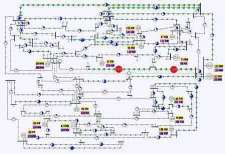
Figure 1 – 67 bus system using a 2D representation with numeric fields
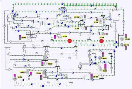
Figure 2 – 67 bus system using a 2D representation with numeric fields and themometers
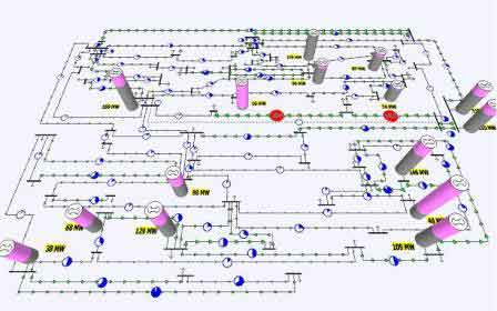
Figure 3 – 67 bus system using a 3D one-line representation
In contrast, Fig. 3 showed the one-line using a 3D perspective view in which objects closer to the display’s frame of reference appear larger (a display’s frame of reference refers to the viewpoint from which the graphical information is shown). The information shown in Fig 3. is identical to that shown in Fig 2 – what is different is how it is displayed. The thermometers have been replaced by 3D cylinders with the height of each cylinder proportional to the generator’s MW capacity. Shading of the cylinder was identical to the shading used with the Fig 2 thermometers. That is, the height of the lower, gray portion was proportional to the generator’s actual output, while the top, magenta portion was again proportional to the generator’s reserve. Note, with the 3D display the numeric generator MW output fields were sometimes blocked by the generator’s 3D cylinder.
III ADVANTAGES AND DISADVANTAGES OF 3D
Before discussing the experimental results it is useful to briefly mention some of the expected advantages and disadvantages of 3D versus 2D visualizations. While relatively new to the power system arena, interactive 3D displays have been used and studied in other industries such as aviation. Certainly the strongest argument for 3D visualizations is we live in a 3D world and our brains are designed to recognize and interact with 3D [8].
A great deal of research indicates that performance of tasks requiring divided attention, information integration, or mental model development, improve with 3D displays compared to their 2D counterparts. For example, [13] found that both 3D line graph and bar chart formats required less time to use compared to 2D line formats for the estimation of global trends, a task requiring mental integration. Reference [11] discovered that performance with 3D scatter plot displays exceeded that with 2D plots for tasks involving information integration, which was attributed to the 3D plots providing superior visual depictions of the intricate shapes of the 3D surfaces.
Of course, there are some potential disadvantages to using 3D visualization, such as perceptual ambiguities of depth, size, and distance, which inevitably occur when the 3D world is graphically depicted on a 2D display [12]. Reference [13] found a performance decrement for participants making relative magnitude estimations with 3D line graphs compared to their 2D counterparts. Reference [14] performed experiments with terrain stimuli and determined that while 3D perspective views enhanced performance on tasks requiring shape understanding, 2D views were superior for precise judgments of angle, distance, and relative position. Research has also indicated that 3D displays are often ineffective visualizations for focused attention tasks, such as determining the precise value of a single variable [13], [15]. In these cases, depth cues in the 3D displays impeded precise judgments of size, distance, and other exact measurements.
Overall, however, the potential advantages of 3D graphic displays over 2D numeric displays are significant. The added dimension and pictorial enhancements will often increase the amount of information (e.g., non-distance quantities) that can be presented on standard display screens, allow for graphic representations of alphanumerics, increase the operator’s sense of presence within the display environment, assist in navigation and search activities, aid in tasks requiring information integration through the creation of emergent properties, enable the separation of targets and distractors at varying depths, and facilitate more accurate mental models of the systems being manipulated.
Although 2D displays supplemented with graphics may share some of the aforementioned benefits (e.g., graphical representation of alphanumerics, enhanced information integration), limiting displays to two dimensions will eliminate many others (e.g., mental integration and divided attention) and may increase clutter. Indeed, the abundance evidence suggests that 3D displays may be an effective visualization technique in the domain of power systems monitoring, control, and analysis. The purpose of this paper is to present quantitative experimental results testing the applicability of 3D power system one-line visualizations. In particular, the use of 3D to present generator MW reserves is examined.
IV EXPERIMENT OVERVIEW
Overall the experiment compared line overload detection and resolution performance using a 67 bus, 15 generator, 103 line system, with generator MW output and capacity (reserves) indicated on a one-line by either numeric fields, 2D bars, or 3D cylinders. This experiment might mimic, at least to some extent, the task a power system operator may need to perform during an emergency situation of determining the extent of transmission system overloads, the resources available to resolve them, and of initiating preventative control.
Before beginning the experiment our hypothesis was that solution times would be faster for the 2D bar and 3D cylinder displays compared to the 2D numeric display because their graphical depiction would aid mental integration of multiple information sources, such as present generator MW output, maximum generator MW output, and available MW reserves. In addition, the salient illustration of generator reserves in the 2D bar and 3D cylinder displays was expected to expedite fault resolution by quickly drawing attention to the generator(s) with the greatest reserves. We further expected that resolution times would be faster with the 3D cylinder display than with the 2D bar display because the nature of the displays allows the 3D cylinders to be sized larger than the 2D bars, making them easier to find and more noticeably indicating changes in output levels.
V EXPERIMENT SETUP AND PROCEDURE
During the experiment, the participants were each presented with a sequence of 40 trials, with each participant receiving the same trial sequence. A trial initially started with no transmission line overloads. Then, following a delay of between 2 and 12 seconds, a contingency occurred, causing overloads on one or more of the transmission lines. All contingencies were either single or multiple line outages. Following the contingency, overloads were indicated visually on the one-line using one of the three different display types shown in Figs 1 to 3. Overloads were also indicated audibly by a continuous, beeping alarm.
After each contingency, any line overloads were indicated on all three display types by the pie charts for the overloaded lines enlarging and their background fill color changing from blue to red with centered gray digits indicating the loading percentage. Any open transmission line were indicated by their one-line representation changing from a solid line to a dashed line, and their pie chart becoming completely empty.
After the contingency participants acknowledged each line overload by clicking on either the appropriate line’s pie chart or the line itself. After acknowledging the violation(s), participants solved each violation by adjusting the MW output of one or more of the generators. This was done by left- clicking on either the generator symbol, the generator output numeric field, or the bar/column indicating output and reserves in the two graphical displays to increase the MW output or right-clicking to decrease the MW output. The MW output was changed by 2 MW per click. Each trial continued until all violations were solved, or it timed out after 120 seconds.
The experiment had 52 participants, 40 men and 12 women, all with self-reported normal color vision. All participants either had completed or were currently enrolled in power system classes taught in the Department of Electrical and Computer Engineering (ECE) at the University of Illinois, Urbana-Champaign (UIUC). Participants were randomly assigned to one of three display groups: 1) 2D Numerical, whose members used the Fig 1 display, 2) 2D Graphical, whose members used the Fig 2 display, and 3) 3D whose members used the Fig 3 display. Hence each group had either 17 or 18 participants. The experiment consisted of 4 practice trials and 40 experimental trials, which were completed in less than one hour. After the final trial, the participants completed a post-experimental questionnaire, which included the NASA- TLX subjective workload assessment [16]. As an example, Figs 1 to 3 depict the system after the first practice trial, a single line outage contingency.
VI RESULTS
For reporting the results, the trials are sometimes differentiated based upon whether the contingency caused a single violation or multiple violations (i.e., problem complexity). Fig. 4 shows the mean response time per trial by display type and task. Note, these results are not differentiated by problem complexity because it did not have a significant effect on response time. Acknowledgment time was significantly faster than solution time (p < .001). Display type did not significantly affect acknowledgment time, but solution times were significantly faster with the 3D display than with the two 2D displays (p = .001).
To further investigate this important result, the solution task times were further differentiated into two categories, 1) the first adjustment time, defined as the time from the acknowledgment of all initial violations until the first generator adjustment, and 2) the adjustment interval, defined as the mean time between generator adjustments following the first generator adjustment. Hence the values in the first category indicate the time it took the participant to figure out which generator to move first.
Fig. 5 shows the mean first adjustment time by display type and problem complexity. As was the case with the total solution time, the first adjustment times were significantly faster with the 3D display compared to the 2D displays (p = .001). First adjustment times were also significantly faster for multiple violation trials compared with the single violation trials (p = .001). In addition, the difference in first adjustment times between single and multiple violation trials was least for the 3D display, followed by the 2D graphical display, and greatest for the 2D numerical display (p = .013).
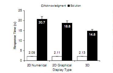
Figure 4 – Response time in seconds.
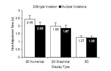
Figure 5 – First adjustment time in seconds.
Fig. 6 shows the mean adjustment interval per trial by display type and problem complexity. The adjustment interval was significantly shorter in the 2D graphical and 3D displays than in the 2D numerical display (p = .039). Opposite the effect for first adjustment time, the adjustment interval was significantly shorter for single violation trials than for multiple violation trials (p < .001). Also, the increase in adjustment interval as problem complexity increased – from single to multiple – was significantly less with the 3D and 2D graphical displays than with the 2D numerical display (p = .001).
Fig. 7 shows the mean upper limit of errors per trial, where an error is defined here as the number of sequences of one or more generator output increases when a generator was already operating at its maximum capacity. There were significantly fewer upper limit errors with the 3D display than with the 2D displays (p < .001). In addition, the increase in upper limit errors as problem complexity increased was less with the 3D display than with the 2D graphical and 2D numerical displays (p = .003). There were no significant differences among the display types for the number of generator adjustments in the wrong direction or the number of sequences of one or more generator decreases when a generator was already operating at zero output.
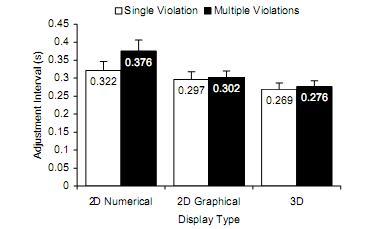
Figure 6 – Adjustment interval in seconds.
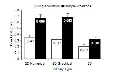
Figure 7 – Upper limit errors per trial.
At the conclusion of the computer simulations the participants’ reported mental workload was assessed with the NASA-TLX [16], with the results shown in Fig. 8. Display type did not have a significant effect on workload scores. However, differences among the six dimensions on which workload was scored indicated that performance, temporal demand, mental demand, and effort were the most significant contributors to overall workload, in order of decreasing mean score (p < .001).
VII DISCUSSION
Overall the 3D display supported the fastest solution times, followed by the 2D graphical display. This is partly because the 3D and 2D graphical displays integrated output, capacity, and reserve into a single object for each generator, which supported the divided attention and parallel mental processing required for the solution task, as predicted by [13], [17], and [18] and consistent with the results of [19]. Because precise judgments were not explicitly required to solve the line flow violations, the 2D numerical display, which would normally improve performance in this type of task, was of lesser value. Another advantage of the graphical displays in the solution task is that generators with large reserves stood out due to the large magenta portions of their bars or cylinders, making them much easier to find than in the numerical display, which required mental subtraction of the output field from the maximum capacity field, consistent with the results of [20].
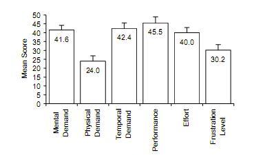
Figure 8 – NASA-TLX as a function of workload dimension
The advantage of the 3D display with respect to the 2D graphical display was likely due to the increased size and salience of the cylindrical generator representations in the 3D display compared to the 2D bars in the 2D graphical display, coupled with a reduced level of clutter in the 3D displays and the perception that the generator cylinders projected out of the one-line diagram, rather than being embedded within it. In addition, the larger size of the generator cylinders in the 3D group made dynamic changes in power outputs and reserves easier to see, enabling operators to better see the effects of individual generator adjustments on the entire system.
Breaking the solution task into subcomponents of firs adjustment time and mean adjustment interval revealed tha the 3D display was advantageous with respect to both th thinking/searching time before beginning the generato adjustments and the thinking/searching time while adjusting Both measures showed reduced effects of complexity for th 3D display with respect to the 2D numerical display, and firs adjustment time showed a reduced effect with respect to th 2D graphical display, as well. Another interesting effect i that multiple violation trials had faster first adjustment time overall but longer adjustment intervals. A possibl explanation is that as the number of violations increased, greater proportion of the generators could help solve th problem, thus requiring less initial search time to find a appropriate generator to adjust, compared to single violatio trials. Therefore, although participants acted faster followin acknowledgment to begin adjusting generators in comple trials, solution times were still dominated by participant spending, on average, more time between generato adjustments.
Reduction of upper limit errors also contributed to faster solution times in the 3D display. Because the 3D display clearly showed when a generator reached its capacity, less time was wasted trying to increase the outputs of generators already operating at capacity. Note that, due to a problem in the 2D graphical display, a generator operating at capacity was still shown with a thin magenta line at the top of its graphical bar, possibly explaining the lack of a significant difference in upper limit errors from the 2D numerical display. The smaller size of the 2D bars compared with the 3D cylinders probably also significantly contributed to the greater number of upper limit errors in the 2D graphical display.
VIII CONCLUSION
The advantages of 3D displays over their 2D counterparts can be quite significant. As this study has indicated, the added dimension can allow non-distance information previously confined to alphanumerics to be presented graphically on standard display screens, aid in tasks requiring information integration, facilitate a more accurate mental model of the system being manipulated, and allow for a better understanding of the interconnected nature and structure of a complex system such as an electrical power grid. However, we cannot conclude that there is an advantage for 3D displays in terms of accuracy. Although our results indicated an advantage in reducing upper limit errors for the 3D displays over both 2D displays, this was the only accuracy measurement that was significant across display types and is not a comprehensive measure of solution accuracy. We predict, though, that 3D displays will improve accuracy in terms of choosing the best generator(s) to resolve a contingency, especially in large networks with many generators, due to their graphical depiction of reserves, reduced clutter, and the perception of the cylinders as rising out of the network.
While more studies are certainly needed, the results of this experiment indicate that 3D displays could be valuable tools in the power system visualization, particularly with the tasks of monitoring and controlling sets of interrelated variables. Specifically, they should improve the speed of high-level judgments of current operating levels in relation to upper and lower limits for parameters such as real and reactive generation, voltage magnitude, and perhaps other reactive power controls such as switched shunts and LTC transformers. With the appropriate software environment power system display designers could use such techniques to explicitly present information in ways that were previously impossible with 2D formats.
IX REFERENCES
1. F. L. Alvarado, Y. Hu, C. Rinzin, and R. Adapa, “Visualization of Spatially Differentiated Security Margins,” Proc. 11th Power Systems Computation Conference (PSCC), Avignon, France, August 1993.
2. P.T. Breen Jr. and W.G. Scott, “Virtual reality applications in T&D engineering,” Proc. Rural Electric Power Conference, May 1995, pp. B5/1-6.
3. A.O. Veh, et. al., “Design and Operation of a Virtual Reality Operator-Training System, IEEE. Trans. on Power Systems, vol. 11, pp. 1585-1591, August 1996.
4. E.K. Tam, et. al., “A Low-Cost PC-Oriented Virtual Environment for Operator Training, IEEE. Trans. on Power Systems, vol. 13, pp. 829-835, August 1998.
5. R.P. Klump, D. Schooley, and T.J. Overbye, “An advanced visualization platform for real-time power system operations,” Proc. of the 14th Power Systems Computation Conference (PSCC), Seville, Spain, June 2002.
6. R.P. Klump, W. Wu, G. Dooley, “Displaying aggregate data, interrelated quantities, and data trends in electric power systems,” Proc. Hawaii International Conference on System Sciences, Waikoloa, HI, January 2003.
7. T.J. Overbye, Y. Sun, R.P. Klump, and J.D. Weber, “Interactive 3D visualizations of power system information,” Electric Power Components and Systems, vol. 31, pp. 1205-1215, December 2003.
8. C. Ware, Information Visualization (2nd Ed.), Morgan Kaufmann Publishers, San Francisco, CA, 2004.
9. T.J. Overbye, G. Gross, M.J. Laufenberg, P.W. Sauer, “Visualizing power system operations in an open market,” IEEE Computer Applications in Power, vol. 10, pp. 53-58, January 1997.
10. EPRI, “Visualizing power system data,” Palo Alto, CA, EPRI Project RP8010-25, pp 6-11 to 6-13, April 1994.
11. C.D. Wickens, D.H. Merwin, and E.L. Lin, “Implications of graphics enhancements for the visualization of scientific data: Dimensional integrality, stereopsis, motion, and mesh,” Human Factors, vol. 36, pp. 44-61, 1994.
12. R.L. Gregory, The Intelligent Eye, Great Britain: McGraw-Hill, 1970.
13. C.M. Carswell, S. Frankenberger, and D. Bernhard, “Graphing in depth: Perspectives on the use of three-dimensional graphs to represent lower-dimensional data,” Behaviour and Information Technology, vol. 10, no. 6, pp. 459-474, 1991.
14. M. St. John, H.S. Smallman, and M.B. Cowen, “Designing for the task: Sometimes 2D is just plane better,” Proc. IEA 2000/HFES 2000 Congress, San Diego, CA, pp. 407-410, 2000.
15. I.D. Haskell and C.D. Wickens, “Two- and three-dimensional displays for aviation: A theoretical and empirical comparison,” International Journal of Aviation Psychology, vol. 3, pp. 87-109, 1993.
16. S. Hart and L. Staveland, “Development of NASA-TLX (Task Load Index): Results of empirical and theoretical research,” in Human Mental Workload, North Holland B.V. Amsterdam, pp. 139-183, 1988.
17. C.D. Wickens, D.H. Merwin, and E.L. Lin, “Implications of graphics enhancements for the visualization of scientific data: Dimensional integrality, stereopsis, motion, and mesh,” Human Factors, vol. 36, pp. 44-61, 1994.
18. C.D. Wickens and C.M. Carswell, “The proximity compatibility principle: Its psychological foundation and relevance to display design,” Human Factors, vol. 37, pp. 473-494, 1995.
19. T.J. Overbye, D.A. Wiegmann, A.M. Rich, and Y. Sun, “Human factors analysis of power system visualizations,” Proc. Hawaii International Conference on System Sciences, Maui, HI, pp. 647-652, January 2001.
20. S. Yantis and A.P. Hillstrom, “Stimulus-driven attentional capture: Evidence from equiluminant visual objects,” Journal of Experimental Psychology: Human Perception and Performance, vol. 20, pp. 95-107, 1994.
BIOGRAPHIES
Douglas A. Wiegmann received his B.S. degree in psychology from the University of Wisconsin-La Crosse in 1988 and his Ph.D. in experimental psychology from Texas Christian University in 1992. He gained post-doctoral training in aviation psychology while serving as a commissioned officer in the U.S. Navy and has served as an aviation accident investigator for the National Transportation Safety Board. He is currently an Associate Professor of Aviation Human Factors and Associate Head of the Aviation Human Factors Division within the Institute of Aviation at UIUC. He also holds an appointment in the Department of Psychology and the Beckman Institute of Science and Technology. His research interests include the application of theories of cognition to the development of technologies for improving human judgment and decision making in complex systems.
Thomas J. Overbye (S’87, M’92, SM’96) received his B.S., M.S., and Ph.D. degrees in Electrical Engineering from the University of Wisconsin-Madison. He was employed with Madison Gas and Electric Company from 1983 to 1991. Currently he is a Professor of Electrical and Computer Engineering at UIUC. His main research interests are power system analysis, markets and visualization.
Stephan M. Hoppe received his B.S. and M.S. degrees in Industrial Engineering from UIUC in 2001 and 2004, respectively. He is currently pursuing a master of divinty degree at Gordon_Conwell Theological Seminary.
Gavin R. Essenberg received his B.S. degree in Meteorology from the University of Oklahoma in 1999 and his M.S. degree in Industrial Engineering from UIUC in 2003. He is currently a research associate at the Cooperative Institute for Mesoscale Meteorological Studies at the University of Oklahoma.
Yan Sun (S’02) received her B.S. and M.S. degrees in electrical Engineering from Tsinghua University, Beijing, P.R.C. in 1997 and 2000, respectively, and she received her Ph.D. from UIUC in 2004. She is currently with ESAI. Her main research interests are in power system visualization and electricity market analysis.
-To the top-